- Website
 Sabin Hertanu
Ember Power Select - How to Add a Custom Create Option
Advanced select components are great for an enhanced User Experience. Giving the user options to do more stuff right from within the select component is empowering UX. The user doesn't have to leave the context of the job he's doing to do something related.
But creating this kind of components is not an easy task in general. Thanks to the great add-on ecosystem, building something like this in Ember is easy. We'll use Ember Power Select to create our little component. This add-on is flexible and customizable so we can achieve pretty much anything we need.
What we're going to build
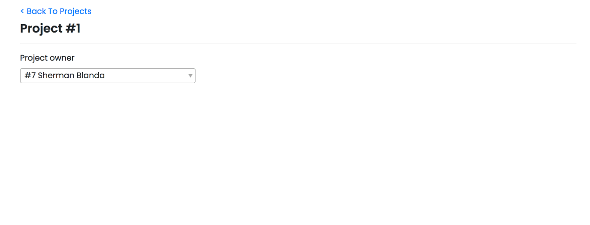
As an example we're going to build a select component with an action to trigger a modal. Let's say for the sake of this example we're building a project management app. Here we'll have a list of projects and we need to assign a user per each project using a select component. If we need to create a new user we can do it right there from within the same component.
Let's create a <SelectUser /> component that looks like this:
<!-- select-user/template.hbs -->

<PowerSelect
  @options={{this.options}}
  @selected={{this.selectedUser}}
  @searchField='fullName'
  @onChange={{this.selectUser}}
  @onOpen={{this.fetchOptions}}
  as |user|
>
  #{{user.id}}
  {{user.fullName}}
</PowerSelect>
We want to fetch the data we're feeding to the select component every time we open it. This way we ensure we always have the freshest data. As a result we avoid creating a record that might already have been created in the meantime. So here is our component.js:
// select-user/component.js

import Component from '@glimmer/component'
import { inject as service } from '@ember/service'
import { action } from '@ember/object'
import { tracked } from '@glimmer/tracking'

export default class SelectUserComponent extends Component {
  @service store

  @tracked options
  @tracked selectedUser

  @action
  fetchOptions() {
    this.options = this.store.query('user', {})
  }

  @action
  selectUser(value) {
    this.selectedUser = value
  }
}
To add our Create User button we need to pass a contextual component to the <PowerSelect /> through afterOptionsComponent. We could also have it to the top of our options by passing it to the beforeOptionsComponent instead. You can read the extensive list of options that you can customize on the Ember Power Select API reference page. I recommend you do that.
So now our component will look like this:
<!-- select-user/template.hbs -->

<PowerSelect
  @options={{this.options}}
  @selected={{this.selectedUser}}
  @searchField='fullName'
  @onChange={{this.selectUser}}
  @onOpen={{this.fetchOptions}}
  @afterOptionsComponent='select-user/create'
  as |user|
>
  #{{user.id}}
  {{user.fullName}}
</PowerSelect>
If we want to have a modal, then the select-user/create component we're passing to <PowerSelect /> can be the modal itself and the create user button can be the modal trigger. So in this example we're using Ember Bootstrap, another useful ember addon. Then in our create component template we can have something like this:
<!-- select-user/create/template.hbs -->

<BsModalSimple
  @open={{this.showModal}}
  @title='Simple Dialog'
  @onHidden={{fn (mut this.showModal) false}}
>
  Hi there
</BsModalSimple>

<BsButton @onClick={{fn (mut this.showModal) true}}>
  Create user
</BsButton>
I know, it looks great and simple. But not so fast. Now when we click the create user button we realize the modal is not rendered. Well, actually it is rendered and destroyed almost instantly. That's because the select dropdown is destroyed on focus out. So when we click the modal trigger, the modal is rendered inside the dropdown component. But this one is destroyed as well as all the components it holds inside.
Data Down Actions Up to the rescue
The idea is to have the modal outside the select component. Makes sense right? Then we need a way to toggle the modal from within the create component. This component can be a button that sends an action higher up and when we call that action we toggle the modal. We know the afterOptionsComponent has access to the data that the <PowerSelect /> has. But how can we pass an action to it? Here we can make use of the {{component}} helper to have something like this:
@afterOptionsComponent={{component 'select-user/create' onCreate=this.createUser}}
So now our component will basically be just a button with the following component.js:
// select-user/create/component.js

import Component from '@glimmer/component'
import { action } from '@ember/object'

export default class CreateUserComponent extends Component {
  @action
  onClick() {
    this.args.onCreate()
    this.select.actions.close()
  }
}
Please notice we're closing the dropdown when we click the create user button by calling this.select.actions.close(). Now when we come back after the creation, we have to open the select and query the server again to see our new user added to the select options.
And then in the <SelectUser /> component we'll have:
// select-user/component.js

import Component from '@glimmer/component'
import { inject as service } from '@ember/service'
import { action } from '@ember/object'
import { tracked } from '@glimmer/tracking'

export default class SelectUserComponent extends Component {
  @service store

  @tracked options
  @tracked selectedUser
  @tracked showModal = false

  @action
  fetchOptions() {
    this.options = this.store.query('user', {})
  }

  @action
  selectUser(value) {
    this.selectedUser = value
  }

  @action
  onCreate() {
    this.showModal = true
  }
}
Then we can call our custom select component and the modal in the same place within our project item component:
<!-- projects-list/item/template.hbs -->

<BsModalSimple
  @open={{this.showModal}}
  @title='Simple Dialog'
  @onHidden={{fn (mut this.showModal) false}}
>
  Hi there
</BsModalSimple>
And toggle the modal:
// projects-list/item/component.js

@action
onCreate() {
  this.showModal = true;
}
Bonus
As a small bonus and to have our small feature complete we'll set the selected user as the one we've just created. This way we'll show some love to our app users and save them a few extra, unnecessary clicks.
Inside our modal we'll have a simple form to create the user. So our project item component will look like this:
<!-- projects-list/item/template.hbs -->

<div class='row'>
  <div class='col-md-4'>
    <SelectUser @user={{@project.user}} @onCreate={{this.onCreate}} />
  </div>
</div>

<BsModal @open={{this.showModal}} @onHidden={{fn (mut this.showModal) false}} as |modal|>
  <modal.header>
    <h4 class='modal-title'>
      New User
    </h4>
  </modal.header>

  <modal.body>
    <BsForm
      @formLayout='vertical'
      @model={{this.newUser}}
      @onSubmit={{perform this.save}}
      as |form|
    >
      <form.element @label='First Name' @property='firstName' @required={{true}} />
      <form.element @label='Last Name' @property='lastName' @required={{true}} />
      <BsButton
        @defaultText='Create user'
        @type='primary'
        @buttonType='submit'
        @disabled={{this.save.isRunning}}
      />
    </BsForm>
  </modal.body>
</BsModal>
// projects-list/item/component.js

import Component from '@glimmer/component'
import { inject as service } from '@ember/service'
import { action } from '@ember/object'
import { dropTask } from 'ember-concurrency'

export default class ItemComponent extends Component {
  @service store

  @tracked showModal = false
  @tracked newUser;

  @dropTask
  *save(model) {
    yield model.save()

    this.args.project.user = model
    this.showModal = false
  }

  @action
  onCreate() {
    this.showModal = true
    this.newUser = this.store.createRecord('user')
  }
}
And voila. We now have a cool select with create component we can reuse anywhere in our app.
You can find this example project on Github and also see it in action here Ember Steps Demo.